Tuesday 9 August 2016

T3 06 Tracing Images

Summary for this section:

Assessment Aim: The included tutorials provide an understanding of how the Pen Tools and Brush Tools work as well as working with type and managing layers in Illustrator.

Design Brief:


Part A: Produce a map of Tasmania, traced outlines of the state, include relief depictions, major towns and roads.

Part B: Trace the Fruit Shop logo previously produced in Illustrator.

Part C: Design an A5 invitation flyer.


Part A: 
Vector image, traced by hand in Illustrator.


Part B: 
Traced this raster image in Illustrator, by hand and by Trace Image tool.


Part C: 
A5 invitation flyer created within Illustrator, including a road map.


This activity introduced me to more complex functions of vector image tracing and drawing, including several hours of using the pen tool. 


CSFrost


Sunday 31 July 2016

T3 - 04 Resizing Images


Summary for this section:

Assessment Aim: This activity is a continuation of Design 3 > LA 07 Grids, Layout and Flow and requires you to work within a set format of a design brief to produce a pre-press ready file.

Design Brief:
You are required to design a CD cover for the TSO (Tasmanian Symphony Orchestra) using Adobe Indesign and Photoshop. You will need images of people’s faces that represent modern composers.


Learning activity: T3 04 - Resizing Images submission.


PDF file ready for print.
'This learning activity required the implementation of knowledge gained on image resizing and print requirements including bleed and CMYK process colouring to achieve a solution to the design problem, as well as a greater understanding of Photoshop and Indesign for design manipulation, layout and print file formatting and packaging.'


CSFrost


Friday 22 July 2016

D3 Assessment Task

Summary for this section:

Assessment Aim:
• To assess students ability to undertake graphic design to produce roughs and finished art.
• To assess students ability to enhance artwork and to meet the requirements of a design brief.
• To assess students ability to undertake basic typesetting skills.
• To assess students ability to inspect the quality of work against job specifications.


DL Flyer (back)


  Postcard (front) Postcard (Back)

My process journal for this assessment can be found here.
'This assessment task required us to complete design processes to produce two different products, incorporating all of the techniques we have learnt so far'


CSFrost


Sunday 26 June 2016

D3 10 Branding

Summary for this section:

This Learning Activity introduces the graphic designer/pre-press operator to interpret a design brief and apply it a checklist.

My logo design (72dpi, RGB)


Extract from my Fruit Shop brief's checklist/rationale:


'Not wishing to use standard fruit references, but still trying to give instant recognition and understanding of the business, I have approached the solution by using this colour scheme.

They have been chosen for viewer impact, allowing for legibility and ease of brand recognition.


Simple shapes, a circle are being used for brand recognition as direct use of fruit shaped objects has been avoided. The shape also holds the text in the negative space.


Simple font schemes will be selected and examples provided to make a selection with the business in regards to the preference and adaptation within the business for a consistent look along business and future marketing'


CSFrost

Monday 13 June 2016

D3 06 Elements of Design

Summary for this section:

In this lesson you will learn about Design Elements, Design Principles and how these techniques to achieve effective communication.

Part D, Design Elements and Principles booklet.


Part E, Textures using Photoshop.

'Design elements and principles are the fundamentals of graphic design and understanding them and how they interact with each other, enhances your understanding and potential as a designer'
CSFrost


Monday 6 June 2016

D3 05 Colour Fundamentals

Summary for this section:

This lesson introduces one of the most powerful tools in a designer's toolbox; colour. This activity is a brief introduction to:
• Terminology
• How you apply colour in your designs
• What determines which colours you choose for your designs
• Resources for learning more about colour.


'Colour is the sensation we experience during the the refraction, reflection or emission of light, but it is so much more'
CSFrost


Tuesday 10 May 2016

T3 03 Digital Camera

Summary for this section:

The following course notes have been compiled to support and provide a basic understanding of the subject area. You are expected to research and read material that will build upon this basic material.

Assessment Criteria:

Complete the above learning activity for marking and feedback. Use Word or Indesign (export to PDF).

Save your file as photo_research.

My Learning Activity submission for this unit can be found here.

The document is in .pdf format; Viewing online you can navigate by mouse scroll, page buttons or keyboard arrow keys. The document has interactive navigation and subject links when viewed in Adobe Acrobat. 


'Simply, the more photos you take, the better and more consistent your photography will become'.

CSFrost

I3 04 OHS

Summary for this section:

This unit describes the performance outcomes, skills and knowledge required to ensure OHS procedures are followed in environments where computers are predominately used but which may require limited access to chemicals and solvents. This unit covers general OHS requirements in business organisations and is relevant for employees using computers and working under direct supervision with no responsibilities for other people.

Assessment Criteria:

Complete and combine all the above Learning Activities into one Word document or Indesign PDF document, use headings for each. Save your file as ‘OHS’.

My Learning Activity submission for this unit can be found here.

The document is in .pdf format; Viewing online you can navigate by mouse scroll, page buttons or keyboard arrow keys. The document has interactive navigation and subject links when viewed in Adobe Acrobat.  

'Workplace health and safety is every employees responsibility'.

CSFrost


Tuesday 26 April 2016

I3 03 Design Industry

Summary for this section:

Design is a practice based on problem solving, aesthetics, materials and processes. It refers to professional design of work involving two dimensions and forms in space, which respond to a brief, and may relate to the design of digital media, graphics, illustrative work, industrial designs, events/exhibits, fashion, jewellery, fashion accessories, furniture, furnishing, interior or urban design.

This unit applies to individuals who need to source and apply knowledge on the design industry to support professional design practice and acknowledges the concept of a design industry and design as a discrete profession.


This section of Industry 3 contains four Learning Activities:
LA01 Constructive Feedback
LA02 Positions vacant
LA03 Trends in the design industry
LA04 Ethical & legal work practises in the design industry

Assessment Criteria:
Complete and combine all the above four Industry section Learning Activities into one Word document or Indesign PDF document, use headings for each. Save your file as ‘Design-Industry’.

My activity tasks can be viewed here.

'The activity work was very broad ranging and made me think of aspects of the industry I had not before, especially in regards to ethics and day-to-day working as a designer and the considerations and decisions that must be made and supported.

Thank you for taking the time to read this post'.


CSFrost


Monday 4 April 2016

D3 LA04 Positive+Negative

Summary for this Learning Activity


Part A:  Positive versus Negative Space
This activity encourages you to explore the nature of negative space to visually interpret a subject.
Part B: Whitespace
Find 4 examples where whitespace has been used effectively.
Assessment Criteria:
For Part A Scan your A4 page as Lineart and save as posnegA.jpg For Part B Scan your magazine advertisements (small file size) and put into a Word document.

Part A, Negative space

1. Clouds
2. Whipped Cream
3. Jaws

Saturday 26 March 2016

D3 LA03 Black Squares

Summary for this Learning Activity:

ACTIVITY 01: To use two dimensional design principles to explore, experiment, develop and extend your graphic vocabulary.

1. Order
2. Increase
3. Bold
4. Congested
5. Tension
6. Playful

ACTIVITY 02: Now, replace these black squares with pictures or text or a page. Find magazine advertisements or business cards that demonstrate each of the six categories mentioned above.

Assessment Criteria:
Complete the above Learning Activity for marking.
For Part A Scan your A4 page as Lineart and save as A_squares.
For Part B Scan your magazine advertisements (small file size)), naming as the following – B_order; B_increase; B_bold; B_congested; B_tension; B_playful


CSFrost


Wednesday 23 March 2016

D3 LA02 Filing


Summary for this Learning Activity:

ACTIVITY 01: Make up a new folder called LA02 and save the files (assessment) to your Cert3GPP >DESIGN 3 folder on your computer. Now make 3 more folders inside this folder – COPY, ARTWORK and LINKS. Note: The Indesign file (.indd) or Acrobat file does not go into any of these folders, it sits all by itself. The LINKS folder should reflect everything that is inside Indesign’s Links Tab/Panel.

ACTIVITY 02: Create an invite using Indesign with the given Photoshop and Illustrator files. Arrange these files in folders as per instructions above. Note - You will use this File Management/File Structure method from now on in this course. Open your PDF file and Save As > Image > JPG. Clearly label and leave a comment describing what you had to do.


My process can be viewed here.


CSFrost


Monday 21 March 2016

I3_02-Workplace

Summary of my process for these Learning Activities:

LEARNING ACTIVITY 01 Workplace
Read the Worksafe Tasmania document for new employees and answered the questions in sentence format. 
My responses are in the 'Workplace' PDF document linked below.

LEARNING ACTIVITY 02 Communication Research
Read the information provided on Communication. I visually interpreted two of the slides. 
My submissions are in the Workplace document linked below. 


The above image is one that I produced, but did not submit. It was for the slide 'Actions speak louder than words'. This did not make the cut as it does not visually represent body language and was rejected. It was created using Photoshop and I used visual references from Google>Images for ideas.

The images used and produced for this activity were also sourced from Google>Images, as were the visual references used. The initial steps of this process can be viewed in my Thumbnail process, documented in my Visual Diary.

LEARNING ACTIVITY 03 Effective Communication
Does it look OK to you? I practiced effective communication by providing positive feedback. I have left my comments on the Industry 3 Forum titled ‘I3 WORKPLACE LA 03 Communication’ as required. My response can also be found in the Workplace document linked below. The initial steps of this activity can be found in my Thumb nail process, in the above visual diary link.

LEARNING ACTIVITY 04 Client Interaction
My ‘client’ is the person who is paying for their business card, which is to be designed by me. I met with the client in person to discuss their needs. Read the required information on how to prepare and upload files to a printer. Wrote down my comments in the Workplace document linked below, under the heading ‘LA 04 Checklist’.

LEARNING ACTIVITY 05 Forms of Communication – Spelling
Answered the questions for A, B, C, D, E and F categories, which can be found in the Workplace document linked below under the heading ‘LA 05 Spelling’.

LEARNING ACTIVITY 06 Discretion and Confidentiality
Wrote down my comments in the Workplace document, using the heading ‘LA 06 Confidentiality’. Left my comment on the Industry 3 Forum titled ‘i3 WORKPLACE LA 06 Confidentiality’.

Completed and combined all the above Learning Activities into one Word document using the headings for each. Saved this document as PDF, named ‘Workplace’ and it is view able here. If opening in Adobe Acrobat, bookmarks are available for access to each Learning Activity.

CSFrost


Saturday 12 March 2016

GPP3 - Industry LA01 - Internet

Summary
In this unit you will be introduced to the skills needed to access and use the Internet within the printing and graphic arts industry. It includes:
• Internet applications and security
• Locating information on the internet
• Email use
• Industry newsgroups, forums and blogs
LEARNING ACTIVITY 01 Searching
Read through the website on recommended search engines which table the most common
search engine and describe how they work. Can you add to this list?
http://www.lib.berkeley.edu/TeachingLib/Guides/Internet/SearchEngines.html
www.lib.berkeley.edu/TeachingLib/Guides/Internet/Googling_Max-Exercises.pdf
Activity Criteria: Read through the above documents and leave your comment on the Industry 3
Forum titled ‘i3 INTERNET LA01 Searching’. Share your knowledge on this topic. What are your tips on searching for files on the internet?

• Read through the website below on email etiquette. Can you add anything?
Links provided did not work and instead I Google searched 'email etiquette'. Top two results used and linked below.
Share your knowledge on this topic.
• What are your ‘pet hates’ in regards to email etiquette?

My process
1. I accessed the activity resources and links. Followed the links, bookmarked for future reference. Followed activities as suggested.

2. Add to the list of search engines:


3. Add to the Google search terms and resources:

Always remember to to search in just images, video or news. Also, to narrow searches use the search tools to filter region of publish, date and search term. Google Scholar is a data base of research documents and Google Books is a data base of public domain books all available for viewing or downloading and there are many other categories of these databases.

4. By participating in the is activity I have added to my GD resource page;

Recommended search engines Both have been linked under the newly created Technology subheading; as well I have added a public file; Graphic Design online tools/websites document which I will add to throughout the course.

5. Researched email etiquette.

http://www.ict.griffith.edu.au/~davidt/email_etiquette.htm

The links, especially the first one are very comprehensive and I have nothing of value to add. My pet hates with emails and etiquette? Co-workers who do not put an Out-of-office message/notification when they are not in the office for an extended period.  


CSFrost


GPP3 - Technology LA02 - Scanner

Summary
Greyscale vs Line art? Line art drawings (eg. clipart) are handy for photocopying and good for crisp, clean images. Black is the only present colour when scanning in this mode. Greyscale mode must be used to preserve any intermediate tones in the images. Obviously Grey mode has 256 shades of Grey. Greyscale is good for scanning black and white photos, like old historical photos. Learning the differences between these two scanning modes, Greyscale and Line Art can set you on the right path and give you good results. Which scanning mode you choose will depend on the original picture, so it’s important to crop/select the picture before hitting the ‘scan’ button, this will dramatically save on file size and time in scanning. This activity requires you to use a scanner and Adobe Photoshop. There are four parts. Use the scanner as per LA01 instructions.

1. Lineart images – choose a cartoon from newspaper Line art image at the lowest, mid and highest scanner settings. Evaluation of the differences between the three images/files.

2. Greyscale images – old family photo or picture from a magazine.
Greyscale image at the lowest, mid and highest scanner settings. Evaluation: the differences between the three images/files.

3. Lineart image – serviette/paper towel Line art 1200 dpi.

Evaluation of the images, Greyscale vs Bitmap and dpi differences and effects.


My Process


1. Accessed course resources, read instructions.
2. Created Notes document, watched resource video and took notes in visual diary.
3. Located a lineart/B&W image to scan and a greyscale image larger than 5x5cm.
4. Located a hand towel/napkin, checked size and durability.
5. Created tables for images, file size and resolution comparison as per video.
6. Scanned B&W image as per directions.
7. Scanned Greyscale image as per directions.
8. Scanned paper towel as per directions.
9. Populated images into tables with file information required, and completed the assessment of images activity.
10. Commenced creating blog post and will update the GPP3 course forum.
11. Moved from working folder to GPP/Technology3 folder, notes document re-created to become activity document and shared for assessment.


Evaluate the differences

Scanning in B&W/Line art/Bitmap significantly reduces the amount of information recorded, as well as quality. The quality can be improved to reduce the jaggy display of pixels, however the image will only contain two colour areas (one, black).


Scanning in Greyscale significantly increases the quality of an image as it produces a range of colours (shades) between the black and white in an image. This results in up to 256 colour areas being recorded and significantly increasing the file size.


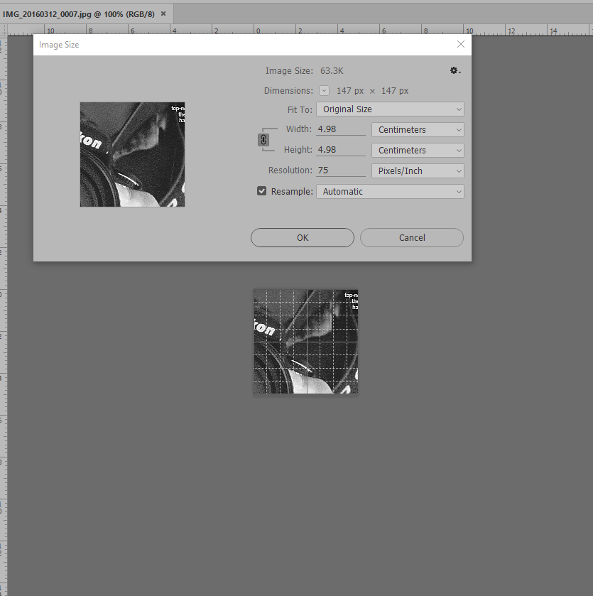
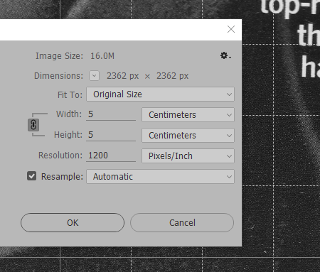
Another difference I noticed when the images were opened in Photoshop was the size of the image within the canvas. All file image areas were 5x5cm, however when displayed on the screen the images were displayed differently. The need to zoom-in on the image demonstrated how much difference in quality/information had been recorded.


2016-03-12 18_34_14-IMG_20160312_0007.jpg @ 100% (RGB_8).png 2016-03-12 18_32_03-IMG_20160312_0005.jpg @ 33.3% (RGB_8).png
The 75dpi (left) and the 1200dpi (right) Greyscale images in the canvas at 100% zoom.


The 75dpi B&W/Bitmap/Line Art image also showed single pixel lines, similar to drawing with the pencil tool and a very small brush.


These images have been saved in this activity in JPEG. Not a standard that is usually used professionally and these file sizes are not indicative of the file sizes of professional digital images and work.


Uses for Bitmap scanning can include capturing of the Thumbnail process or scans of quick sketches as well as for designers and animators who are intending on using the image for vector graphic work. An increase in quality of the scanned image will result in much more professional vector conversion or image to trace.

Greyscale allows for images to be captured in greater detail. However, the cost of this detail is the increase in file sizes. Lower dpi means more noise is captured instead of the smooth gradients over the scale.


Full learning activity can be viewed here.


CSFrost